Monday, May 9, 2011
Judging A Book By Its Cover
 I admit, I’m not always the sharpest hoe in the garden shed, but even I pick up on a pattern now and then. As aspiring writers, we’re often asked what it is about our books that will make them stand out from all the others. Then if we ever manage to come up with a stellar response to this question and convince an editor/publisher to buy the thing, what do they do to it?
Make it look like all the other books.
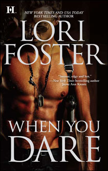
We all know authors have little, if any, say in their covers. Back in the day (meaning back in ancient times when I started reading Romance) the big deal on Historical covers was the long haired, bare-chested hero (Fabio, anyone?!) holding the long-haired heroine in a domineering embrace, their hair whipping in the wind. Often in opposite directions, which always cracked me up.
And today is no different.
I’ve sprinkled examples through the blog and I’m sure you see the patterns as well. I often wonder if early 19th century modistes aren't rolling in their graves at the idea of all those dresses just falling off with what looks to be no help whatsoever. (Okay, the chick in the green dress might have had some help.) Or maybe the maids are rolling over knowing no self-respecting Lady’s Maid would allow her to leave for a ball without her dress properly cinched, shackled and shellacked.
 Contemporaries seem to have a little more variety, but they do share one trend with Historicals – the headless heroine/hero. I’ve read many complaints about the head-chopping of these poor, defenseless models, but I kind of like it. Let’s face it, the model on the cover rarely resembles the character described inside and almost never matches the image we form in our minds. So give me the neck down and I’m good.
But really, if I had my druthers, I'd prefer no people on the cover a la Crusie or Debbie Macomber.
 What do you think? If you’re a writer, have you ever mocked up a place-holder cover for your book? *raises hand high* Do you dream about what your real cover will look like some day? As for the options on the shelves now, are you tired of heroines losing their dresses (and where are the shifts and stays???) Do you mind having a headless model on the cover? Do you care about the cover at all? (And feel free to talk about the man-candy on Romantic Suspense books. I had to throw one of those in too.)
Subscribe to:
Post Comments (Atom)
Books by the Crew


47 comments:
I find historical covers a bit...repetitive, to be frank. The colors are gorgeous and the dresses are so pretty! And all those perfect backs!
It's the UF covers that kinda annoy me...the kick ass feminine lead, holding a 1)crossbow 2)gun 3)whip (though that's a bit more erotic romance) 4) a spear 5)a dagger 6)a samuri sword... You get the gist.
I like covers without people or with sketches, to be perfectly frank.
Saying that... I adore, passionately, my cover of The Kraken's Mirror. Just enough heroine to portray a pirate feel and love that she's wearing red nail polish and pearls/garnets, etc.
Not very keen on the headless shot. I prefer the cover to show tension of the hero and heroine.
Chemical Fusion
Have to agree with most of what you say Bo'sun.
Nearly all the books I buy are electronic and recommended in reviews or blogs. I don't bother much with the covers for mainstream authors.
The new breed of self-pubbed authors on Amazon are different though!
I like to browse the top 100, especially the low priced (under £1) books and often the cover tempts me to click and learn more.
When you self-pub on Amazon you get to design your own cover and set your own price. For two examples which buck the trend for romantic suspense have a look at:
http://lexirevellian.blogspot.com/
Great blog, Ter
I also am tired of the unbuttoned dress sliding down a smooth, bare back, with a perfect ringlet of sunkissed, golden-blond hair trailing over one shoulder. God help me if there's also an adorable mole revealed as she seductively lets her dress slide down.
Uh yeah, I've never worn a 19th century ball gown, but I'm pretty sure that's not what normally happened when you unbuttoned them.
And don't get me started on the covers consisting only of a shirtless, tanned, set of abs.
Well, okay, that one doesn't bother me, because, let's face it, they find some HOT models. I feel like I *should* be all righteously riled-up about the covers with only male abs (and really, I do get tired of seeing them), but I'm too distracted to get really worked up :) Why don't the guys in my life look like that? lol
I definitely fantasize about what the cover of my book would look like. A dark, rainy night. One eerie street lamp. A crouching figure with a gun.... (geez, even the covers I fantasize about are cliched :) )
Well, everyone is up and at it early this morning. Even me! LOL!
Chance - HOW could I forget you have the headless model? I should have used your cover. Doh! I do sense a theme there with the UF covers. LOL! And this isn't new with all the covers looking alike, but at least back in the day, the titles were slightly different. Thank goodness we're getting a little variation there now, even if the Historical titles don't sound Historical at all.
Hey there, Enid, thanks for stopping by. Not a fan of the headless crop? I don't why that doesn't bother me. But I'm with you in that if they are going to put people on the cover, at least use both the H/H instead of just one.
However, I've never put a book down and refused to read it just because of the cover.
Nice mix of covers over there, Q. A lot of writers seem excited about the idea of designing their own covers, but if you want your book to be remotely taken seriously, you need a professional looking cover. Even moreso if you self-publish. Professional takes money and lots of work so this can be a case of careful what you wish for. :)
Hal - I don't know why it bothers me so much, it's not like many covers are ever historically accurate (the buttoned up men's shirt anyone?) but that dress falling off thing just drives me batty. I do appreciate the gorgeous colors, but either keep the dress on or take the dress off. Pretend you're not insulting our intelligence.
And what kills is, I don't even think there are many scenes where dresses just fall off. LOL! So it's not like they're portraying the story!
Yeah, can't say as I mind the man-candy. Though you have to wonder a) are all RS set in really hot locations? and b) would any self-respecting man of action race into a showdown with the bad guy with nipples blaring??
Your cover idea sounds great. And a character in the scene somewhere I could live with. Much better than the character filling the entire scene.
In honesty, I find all these covers equally appealing. Pretty dresses with sparkly scrolled letters, headless folks, naked man chest. It's all fine and the marketing works. But that's my problem, I think. It all blurs into one big happy marketing vat of obscurity. I don't remember what the covers of most books look like because they all look the same.
There are always the exceptions. The cover of Julia Quinn's upcoming novel, Just Like Heaven, is gorgeous, historical feeling, but without the wardrobe malfunctioning, back-sporting heroine.
I noticed that one, Marn. Yes, that's a nice direction. I think it was Candace Hern *googles* who had some beautiful covers for her Merry Widows. Very Renaissance painting inspired that resembled the portraits one would expect to see of a 19th century Miss. I do wish those would have caught on better.
I can remember covers a little more than titles. The titles are totally interchangable anymore, but at least you can remember you're looking for the vibrant yellow cover or whatever. Saw a cover for a friend (yet unreleased to the public) and it's pure white. Absolutly gorgeous.
I guess I see the covers as being like the query letter -- something to intrigue you to take a closer look at the story. :) I think it's intended to be symbolic (half-dressed = smexy times ahead), not an exact representation of the story or even the characters, and I don't know that it's meant to be (even if we as readers think so.) I also can't imagine how difficult it must be to keep coming up with a variation of poses to accomplish that "psst, look at me!" goal. And then there's the artistic limitations (chest hair usually looks like dirt, so that's why it's excluded, etc.)
The only thing that makes me smile is how all the dresses seem to be made of SATIN, which wasn't the case in Regency times at least. But I think it's one of those things that works artistically because it shows texture and it would be too flat otherwise.
For me, I always want the cover to reflect the book. I think you can do that and still be eye-catching. And I do not mean to belittle how hard it must be to come up with a good cover, but I see the irony in the demand my book be different enough to stand out from the rest but then they make it *look* like all the rest. :)
I love covers--and yes, the right cover will make me pick up a book or send me running. I prefer headless men. Or the half-head men, where you see their lips and their splendid chest and nothing else.
I also like women's backs on covers, usually with a man's hand placed possessively on her lower back or hip.
I ignore--or mostly ignore--historicals with women falling out of their clothes and they're never wearing underwear. It bothers me more when the men's shirts are split down the middle, when we all know they weren't. But on the whole I ignore it. It bothers me much more of the historical inaccuracy within the covers than anything the artist did.
If I were mocking up my own cover, I don't think I'd put Adam and Eve on the cover. I think I'd have one of those covers where you saw props from the book. Like the Counselor's Handbook for Marriage Bootcamp and a beach/paradise area, and things that look like a resort. Or if I did put them on the cover, I'd put them back to back to each other, arms crossed, shooting pouty looks at the camera.
I can't ever think of a time I've not bought/read a book because of the cover. I will admit, and I might be crucified for this, if I'm looking at ebooks and especially self-pubbed books, I judge the covers more harshly. Thankfully, ebook covers have made tremendous progress.
I'm in the "litter the cover with props" camp as well. I remember books with a locket and a music box. Or a bouquet of flowers and a picture frame. I like those covers that hint at the story and are pretty. Didn't Crusie's fans because Cherries because of the cherry on the shoe on the BET ME cover?
It's a fine line to walk, I think. You want something that readers are going to recognize as part of the genre for fear that they'd skim over it in the bookstore. But you want to stand out too.
I'm glad I don't have to design covers.
A fine line, indeed, Marn. You'd almost be tempted to think covers will grow less important in the digital format, but it's more likely the opposite. When readers are trolling through a website, your cover HAS to stand out and make them stop. Smaller image, digital, 2 dimensional. Well, they're always 2 dimensional but you know what I mean. It's going to be tougher than ever to catch the eye of the reader who isn't specifically looking for you.
I have to give a shout out to Kimberly Killion who is doing amazing things with Hot Damn Designs. Her covers are gorgeous and professional and I'd venture to say better than some coming out of NY these days.
And I just saw that you can win breakfast in bed with a cover model at RWA11. Check it out!
http://www.hotdamndesigns.com/raffle.asp
Kimberly's designs are awesome. I remember seeing some of the covers of some of the books she's designed for and thinking they looked better than NY's glossy covers.
But then Kimberly designed her website and it's cooler than 90% of the author websites out there. *LOL*
*drool* My all time favorite book cover is Pamela Clare's Hard Evidence cover. Shower. Water. Passion.
Hot.
I actually miss my old laptop that had my design programs. I miss just working with images and creating something fun. And fonts. I have an obsessive love for fonts. But it's time consuming and if I want to write (and let's face it, I have to work) I have to give it up. For now.
I almost used the new cover for BREAKING POINT as the man-candy cover. LOL! There is something about those low slung jeans. *sigh*
*dreamy look* Ooh, hell yeah. Anything low slung over those hips is nice. Straight out of the shower, well fitted but low slung sweatpants and a towel in hand... that will spike my temperature 100 degrees in a second and my brain will have a meltdown.
Geez, Sin, you're making my mouth water. LOL!
Kiddo has found this new toy online where she doctors up pictures and makes collages for all her friends' Facebook accounts. She can spend hours on that thing but I have no idea what it's called. I know it's free.
I wouldn't resist taking a webdesign/graphics class in the future. Being able to maintain a real website and make it look good is another bonus in this author game.
And today is Hal's birthday. Happy birthday Hal!! I hope it's a fantastical day filled with lots of half naked guys fulfilling your heart's desire.
Sure, Sin, you'll out other pirate's birthdays, but when it comes to YOURS, you're more secretive than the CIA.
But on the other hand, HAPPY BIRTHDAY, HAL!!!!!! Please have some cake!
I didn't remember it was Hal's birthday until this morning when I saw it on Facebook. LOL! If I'd known last night when I was freaking trying to find a topic for today, you better believe this would have been a party day!
HAPPY BIRTHDAY, Hal!! Hope it's a great day with lots of cake and baby smooches.
I'm with Sin...I love a good font. And sometimes the fonts for historicals will drive you insane with trying to read them. Too many flourishes and too many curls, etc.
That said, I also love the font used on my cover. It just feels right.
But I also love the cover littered with props. I used to see that a lot with mysteries and it's intriguing. I remember the Tea Shop mysteries and all the tea paraphernalia scattered on the cover. Or the Lacy Smithsonian series with props from whatever specialty she'd be menanced in... Or Annette Blairs Vintage Fashion series! Some gorgeous covers with clothing details to die for...
Covers really do tend to draw the eye and though I find the historical ball gowns pretty to look at, they have nothing to do with whether I pick the book up or not.
Now put a nice piece of chocolate cake on the cover...
I loved the cherries on Crusie's book!
It's funny, cause when I first started back reading romances I intentionally stayed away from Fabio/naked chest/half naked ladies covers because I assumed the writing wouldn't be as good.
The first books I checked out from the library (The Bride by Julie Garwood and An Offer From a Gentleman by Julia Quinn) had very subdued covers. TB just had the author's name really huge on top and the title written below in very fancy lettering. AOFAG had the title most prominent on the cover above a glass/satin slipper. Very classy. I'm a big fan of JQ's covers. Lisa Kleypas also has some pretty classy covers.
I'd have to say the last covers to really hit me were Meg Benjamin's from her Konigsburg series. They striked me as being fun books just by looking at the covers. And they were right! I'm on book #3 and am really really enjoying them.
Chance - I'm with you on the fonts. Nothing bothers me more than when I can't figure out what the hell something says. Fancy is fine, but not THAT fancy.
Your cover is right. With or without the tentacle. LOL!
Irish - Hellie and I were just talking (in email) about the Garwood covers. There were very simple and understated but beautiful and still reflected what could be found within.
I never shied from the hunky dude covers, but they were never a big deal for me. I started reading Romances pretty young and no one in my house batted an eyelash as the covers. I carried them around Catholic school and though some girls looked at me a little weird, no one ever told me to put them away or not to bring them.
There are covers I see today that I wouldn't carry around, but those are the extreme ones. :) I'm so happy you're loving the Benjamin books. Thank Janga and Lindsey for pushing me to try them!
I do admit I tended to shy away from most Fabio covers because like Irish, I thought the content wouldn't be as good. *LOL*
Esp the Fabio covers of books "he'd written." WTFE.
HOWEVER, my exception to these were Johanna Lindsey books, which I enjoyed but had Fabio all the time. Some awful covers, but I did enjoy the stories. *LOL*
I can remember the books I was reading while still in Catholic grade school...and putting plain brown wrappers on the because I knew the nuns would object... You'd think they'd figure out that if I put a cover on it, there might be a problem. But I suppose...don't see, don't have to object. I was also a bit of nun's pet, so that might have been part of it.
I know when I talk to the newbies about pennames, we discuss the fonts used and how sometimes, I long name can be flourished to hell and back or made so small you might need a magnefying glass...
Dude, Fabio was the "get" model. LOL! If you had him you were a top writer! I don't even know how many Lindsey books are on my shelf sporting Fabio's flying hair.
Chance - You and I attended Catholic school in different decades. :) I never thought about how long your penname should be. Mostly because I don't have one. LOL! Now I want to play with Fonts, but I don't have good ones on my computer.
I loved Candice Hern's art covers. I too wish they had been more widely popular. One of my all-time favorite covers is Jo Beverley's Three Heroes because the images match the characters.
http://www.jobev.com/george.html
I can still get steamed when I think of the cover of EJ's Pleasure for Pleasure cover. I'll always be glad that I have a copy of the ARC with the orinal cover. The ulta thin heroine on the final cover definitely is not Josie.
I don't know that I've ever bought a book because of its cover, although I have passed on some because I was embarrassed to take them to a cashier who might be a current or former student. Honestly, the covers I pay the most careful attention to are those of friends' books that I get an early peek at. I saw one last week that is just perfect.
I have bought a book for it's cover. Scape did a blog about this last week, more the what was your favorite and I told her about one I bought that my husband pulled off the shelf and held out to me. Fascinating cover... A hotel room nearly filled with water and a man suspended in the water, just his face above it... Very spooky, very evocative. I bought it, loved it and read everything the author ever wrote.
I have seen covers on e-books that made me look away and just see them as so amateur I didn't even want to go there.
And Bo'sun..if you're gonna pick a pen name, I always advise keep it simple and easy to spell... The shorter it is, the larger font it will be. If I ever publish anything I need a pen name for...like something so disturbingly erotic that I don't want my normal readers to know I wrote it - it could happen! - I'd go for something like Lily Brand or Mira Bay... Easy peasy names!
That does sound like an evocative cover, but that's apples to oranges when we're talking Romance novels. Romance have to "look" like Romances so that kind of shock value (unless it's sex or naked fless apparently) doesn't really work.
I have no intention of creating a penname unless some publisher insists, and then they'll still have to convince me. LOL! I do have one for the erotic romance stuff, but I never did anything with that and don't plan to anytime soon. The name was a mash up of my real name.
I know I'm running out of steam, my comments are making less and less sense.
That is a good cover, Janga, and I've no idea how I missed it? I don't think I've ever even heard of that one. Huh. Weren't Candice's covers beautiful? Maybe I just like them because the female form portrayed is pale and slightly plump. :)
Don't even get me going on the PfP cover. So. Wrong. The entire story was about body image and acceptance and that cover was just as slap in the face.
I suppose that is the drawback of being handled by a big publisher...little to no say in your cover. I had a lot to contribute to my cover design, even to changes and requests...
Even if they do lose my tentacle when it made print. But that wasn't by design!
Honestly, the covers I pay the most careful attention to are those of friends’ books that I get an early peek at. I saw one last week that is just perfect.
Oh, hell, yes! Totally agree. *LOL*
I'm an artist, so covers do matter to me. But most of the covers coming from the big commercial presses are okay. At the very least, they look professional. There are, however, still some dog-awful covers coming out from some small presses and epubs. "My first Photoshop project" quality. Awful colors; poor layout, edge effects. Ugh.
So true, Pat. The first photoshop homework assignment! ;-)
Chance - Stop bragging. LOL!
Pat - Some are so frightening, aren't they? But even some big house covers are awful. I think that "Worst Cover/Best Cover" contest is running right now and the Worst nominees are bad. And they aren't all from small presses or epubs.
No, I won't stop bragging! ;-)
I figure I'll start getting the ideas for the cover of the second book soon and I can't wait to see what they come up with! ;-)
I thought we talked about the cover for the next one. Tell me you remember because it was a pretty killer idea.
I submitted all the ideas...it all comes down to what the cover artist can put together from stock photography!
There are no stock photos of sexy 65 year old pirates, which is why I don't have on my present book! So, we'll see what she can find to meet the criteria for The Chameleon Goggles.
Post a Comment